Touchpoint
From Reactive to Proactive:
Designing a Real-Time Control System for Self-Checkout Operations
Who I Designed For: Lowe’s | Platform: Desktop | My Role: Lead Designer - Research, Strategy & UI
Created and improved an internal mobile app empowering a single front-line employee to manage up to 8 self-checkout lanes quickly and effectively. I designed solutions to help employees monitor customer assistance requests, potential theft indicators, system alerts, and operational needs in real time. This solution led to 57,000 daily launches at peak adoption and a 3% decrease in cart abandonment.
Setting the stage
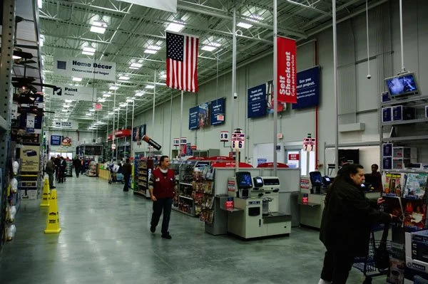
In-store, a single employee often oversees up to eight self-checkout kiosks at once. They must respond to customer assistance requests, monitor potential theft, resolve system errors, and manage operational tasks in real time. Delayed intervention affects customer satisfaction, shrink, and transaction throughput.
I led UX for a net-new mobile application designed to transform self-checkout supervision from a reactive, light-based system into a proactive, alert-driven workflow. My role focused on experience strategy, shaping notification behavior, lane visibility, and operational controls to reduce cognitive load and accelerate employee response time.
Early findings
To ground the product direction in front-line reality, I conducted in-store exploratory interviews across four locations, speaking with 9 employees including cashiers, head cashiers, and front-line managers. I observed live self-checkout supervision during peak hours to understand how employees actually managed lane volume in practice.
Across stores, a consistent pattern emerged. Employees were operating in a constant reactive mode, moving rapidly from kiosk to kiosk to resolve price overrides, age verification requests, and transaction errors. They relied heavily on customers flagging them down or the overhead lane light flashing to signal assistance. With multiple kiosks requesting help simultaneously, there was no clear indication of which request came first, creating anxiety around response time tracking and performance expectations.
Employees voiced frustration with delayed manager approvals for price changes and the need to physically track down back-office staff to address low cash levels. The lack of centralized visibility forced employees into fragmented workflows, increasing cognitive load during already high-pressure peak periods.
Following interviews, my team and I affinitized notes to surface patterns in employee sentiment and unmet needs. From there, we developed exploratory journey maps and storyboards to illustrate a potential future state — giving stakeholders a tangible way to see how a purpose-built tool could change the day-to-day supervision experience. These findings pointed to a single root cause: employees had no centralized way to understand what was happening across their lanes at once.

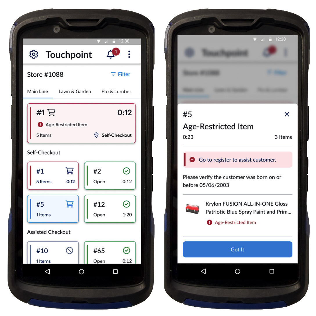
MVP Home screen to give a live view of assigned registers and their status
Designing a Solution
We had limited development team capacity to kick start this new app. Given the dev constraints and user needs, I worked with stakeholders to prioritize our MVP scope — focusing on visibility over action, knowing employees needed awareness before they could act. To inform that scoping, we used a feature prioritization matrix to weigh potential features against development difficulty and user impact, giving us a defensible rationale for what made the first release.
Research made clear that the app needed to first serve as a visibility tool, giving employees a reliable way to see which registers needed attention before anything else. Our initial release included the following features:
Select specific store zones and registers to supervise
View live register states including open, in-use, and closed
Access a real-time cart view to understand transaction context
Receive push alerts when customer assistance was requested
With our priorities aligned, my junior designers and I used Figma Make to rapidly generate early concepts, allowing us to explore multiple directions quickly before committing to a direction. This accelerated our feedback loops with stakeholders and kept ideation moving in parallel with ongoing development planning.
This design solution created a foundational shift from passive observation to active monitoring. Instead of scanning the physical environment for signals, employees could reference a centralized mobile view to assess lane status instantly.
The live cart view was particularly important. It allowed employees to preview transaction context before arriving at the kiosk, reducing unnecessary back-and-forth and accelerating resolution time.
Expanding Capabilities
With foundational capabilities rolled out to initial stores, the next phase focused on enabling employees to take meaningful action directly from the app. Each subsequent feature release was validated through in-store user testing, where employees completed task-based scenarios evaluated with Single Ease Question ratings. A final UMUX score gave us a standardized measure of usability at the release level, ensuring new capabilities were genuinely improving the experience before we moved on.
The goals across this phase were consistent: reduce physical back-and-forth between kiosks, streamline escalation workflows, and give employees greater control over live transactions.
Transaction Editing and Cart Intervention
Employees frequently needed to adjust item quantities, remove items, or correct scanning errors during active transactions. Previously, this required navigating the kiosk interface directly while customers waited.
I designed remote cart-editing capabilities that allowed employees to add, remove, and modify item quantities from the mobile app. By surfacing a live cart view and enabling intervention before physically reaching the kiosk, the workflow reduced transaction friction and shortened resolution time during peak hours. Employees could preview and resolve transaction issues before reaching the kiosk, rather than approaching each one blind.
Theft Reporting and Risk Visibility
Employees were expected to monitor potential theft while simultaneously assisting customers; however, documenting incidents was fragmented and often delayed.
I designed a quick-entry workflow for flagging potential or thwarted theft directly within the app, reducing friction between detection and documentation by integrating shrink awareness into the same tool used for customer assistance.
Remote Manager Overrides
Price overrides required manager intervention, often forcing employees to leave their supervision zone to locate a manager.
I introduced a structured manager override request flow paired with a dedicated manager view, allowing managers to see incoming override requests in context and respond more efficiently. This enabled managers to handle remote price approvals, removing the need for employees and customers to wait for a manager on-site.
Dynamic Register Assignments
Register coverage was previously managed verbally — managers communicated lane assignments as needed, with no structured way to track who was responsible for which kiosk.
I designed a lane assignment workflow that allowed employees to claim registers directly in the app, while also enabling managers to assign specific lanes to employees when needed. When a register was reassigned, the previously assigned employee received an automatic push notification, replacing the need for managers to notify them in person.
This formalized coverage handoffs into a documented, app-driven process, giving managers clearer visibility into supervision responsibility across the floor.
Results and Next steps
At its peak, the app averaged approximately 57,000 daily launches, cementing its role as the primary tool for self-checkout supervision across stores. Improved employee response times contributed to a 3% decrease in cart abandonment — a direct reflection of what happens when employees can act faster and customers spend less time waiting for help.
Feedback from employees was consistently positive, particularly around reduced friction in transaction edits and clearer escalation workflows. What began as a monitoring utility had evolved into a centralized operational system used throughout the day by front-line employees.
As adoption scaled, new complexity emerged. Increasing notification density during peak hours surfaced early signs of alert fatigue, highlighting the need for structured prioritization and dismissible alert patterns — an area I had begun exploring before the team was laid off.
Additional directions I was exploring with my stakeholders included multi-item price adjustment workflows, store paging integration for car-loading coordination, and enhanced escalation patterns to further reduce physical dependency on managers. These remained concepts in progress rather than committed roadmap items.
Reflection
This project pushed me to operate with a high degree of self-direction. As the primary designer, it was my responsibility to interpret business needs, push toward a better experience, and propose solutions that were both practical and technically feasible. The app's deep interplay with existing register systems meant I constantly had to design with adjacent systems in mind, not just the product in front of me.
I also grew in how I guided junior designers, learning to delegate more effectively while keeping the experience vision coherent. Leaning into AI tools for rapid early concepting — and seeing how much it accelerated our ideation cycles — changed how I approach the earliest stages of a project.