Home Renovation Calendar and Appointments
From Back-and-Forth to Booked: Redesigning Scheduling for Lowe's Renovation Teams
Who I Designed For: Lowe’s | Platform: Desktop | My Role: Lead Designer - Research, Strategy & UI
Created a digital booking and calendar ecosystem for an internal home renovation tool, replacing a fragmented, phone-based manual process. The redesign saved an average of 26 hours of per appointment, drastically increasing operational capacity and providing real-time visibility into employee performance and scheduling.
Background
When a customer renovates their kitchen through Lowe's, the project involves a series of coordinated appointments spanning initial consultations, measurements, design reviews, and final walkthroughs. Historically, each of these was scheduled manually through a cycle of calls, voicemails, and back-and-forth emails that could stretch a single booking across days or even weeks, quietly adding unnecessary time to every project's lifespan.
The business recognized that this back-and-forth wasn't just inefficient — it was a structural drag on project timelines and a direct source of customer frustration. The ask was clear: get employees off the phone and back to servicing projects. I partnered with stakeholders and the development team as lead designer, responsible for research, strategy, and UI from discovery through delivery.
Current State Problems
The existing scheduling tool collected customer data and managed appointments, but it had two fundamental gaps: it wasn't integrated with employees' work calendars, and it had no customer-facing side.
Since there was no calendar integration, double-booking was a recurring risk. The app displayed appointments in a sortable table view rather than a calendar, so employees had to manually cross-reference their Outlook calendars to check availability before confirming any time. The constant context-switching between applications slowed down every booking and introduced room for error.
Because customers had no way to self-schedule, every appointment had to be arranged over the phone. This created a process of back-and-forth calls. If an employee couldn't reach a customer, or a customer missed an appointment, follow-ups and rescheduling set the project back by an average of two business days.
Research & Discovery
To move beyond assumptions, I set up video call interviews with five kitchen designers to observe the current state firsthand. Rather than asking them to describe their frustrations abstractly, I had each designer walk through the live system and show me how they actually operated day-to-day. Watching them navigate the Salesforce table view, context-switch into Outlook, and manually log phone attempts gave me a clearer picture of the friction than any survey could have.
Two findings shaped everything that followed. First, designers were managing a high volume of projects simultaneously — scheduling overhead compounds across every one of them. Second, a portion of their compensation is tied to customer satisfaction, meaning delays didn't just frustrate customers. They directly affected the designer's income. The stakes were higher than the business had framed them.
Adjusting Scope Based on Research Findings
The original brief called for a 1:1 recreation of the Salesforce experience within our internal ecosystem — a lift-and-shift MVP. I had two paths: deliver what was asked, albeit a subpar experience for employees, or use the research to make the case for a more complete solution. Rebuilding the same broken flow in a new wrapper wouldn't solve the underlying problem, and the compensation finding gave me the business case to say so. I brought the findings to stakeholders, made the case for expanded scope, and the business agreed.
The research also surfaced a longer-term need: without a centralized view of availability inside the ecosystem, scheduling would always require employees to context-switch into Outlook. Fully solving that problem would mean building an internal calendar — but the business priority was clear: Get appointment scheduling shipped first. That dependency was noted and set aside, with alignment that it would be revisited once Phase 1 was in market.
Phase 1:
Appointment Scheduling
Replacing phone-tag with a fully digital booking and management flow.
Phase 2:
Employee Calendar
Building a centralized source of truth for employee availability
Phase 1
Scheduling and Managing Appointments
Since I was designing a net-new element within an established system, I worked closely with other designers to ensure my components aligned with existing design system patterns and visual language.
I began by exploring various iterations of an “Appointments” widget, a persistent surface within each project that would display existing appointments and allow employees to create new ones. A key tension in the widget design was information density: it needed to surface enough detail to be useful at a glance while not surpassing a maximum size. These iterations went through several rounds of design critique before the concept was solidified.
With the widget direction established, I designed a side drawer to house the actual scheduling flow, consistent with interaction patterns already used elsewhere in the ecosystem. Rather than presenting a generic empty form, I drew on research findings to introduce appointment type templates, pre-filled options based on the type of appointment being scheduled. This reduced the cognitive load of setup and helped ensure appointments were created consistently across the team.
One of the more complex design challenges was handling time selection. Surfacing every possible time slot would overwhelm employees managing multiple projects, so I designed a filtering system that let them narrow results by time of day (morning, afternoon, or evening), duration, and timezone, surfacing only the windows most relevant to when they were actually working.
Beyond scheduling, I also designed a detail view within the drawer that allowed employees to review appointment information and update its status, marking it as completed, cancelled, or a no-show. I had initially designed a notes field directly within the appointment drawer, giving employees a way to document anything relevant without leaving the flow. When technical limitations ruled that out, I had two options: remove the capability entirely or find a way to preserve it within the existing system. I designed a redirect to the project's existing notes section instead. It introduced an extra step, but it kept the capability available despite development limitations.
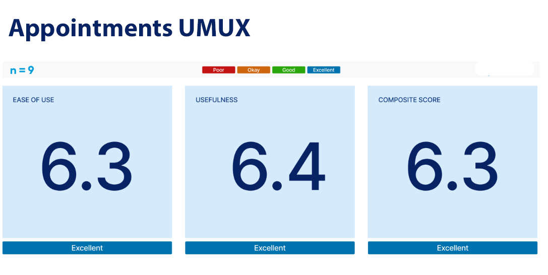
The scheduling flow was validated through usability testing with nine participants across three roles: two virtual design supervisors, three design presale coordinators, and four virtual designers. No critical issues emerged, but testing surfaced two refinements worth addressing. Designers were unfamiliar with the updated project status labels, which prompted clearer labeling and supporting context within the flow. Testing also revealed ambiguity around whose timezone the scheduler reflected, a small but meaningful detail when coordinating across regions, which was resolved with explicit timezone labeling at the point of selection.
From Scheduling to Availability
Shipping the appointment scheduler gave employees a faster, more reliable way to book and manage appointments within a project. But a familiar friction remained: before proposing any time, employees still had to leave the system and check Outlook to confirm they were actually available.
The research had flagged this gap early. A truly seamless scheduling experience required employees to have a single, reliable view of their availability inside the same ecosystem. The business was aligned on the need, and with Phase 1 in development, the priority shifted to closing that loop.
Phase 2 was focused on building exactly that.
Phase 2
Creating a Source of Truth for Availability
Phase 2 introduced a dedicated calendar view living outside of individual projects, serving as a centralized source of truth for each employee's schedule within the home renovation ecosystem.
The calendar supported month, week, and day views, with the week view serving as the primary working surface. Employees could see their configured working hours, non-working periods, and any time blocked for lunch, out-of-office, training, or administrative tasks alongside their project appointments, all in one place. Outlook sync surfaced blocked time from employees' existing calendars, eliminating the need to cross-reference two systems when checking availability.
Employees set their working hours during their first login and could edit them at any time. This was a deliberate design decision rooted in research. Designers occasionally shift their schedules, and without an easy way to update their hours inside the system, availability information would quickly fall out of sync with reality.
To complement the calendar grid, I designed a left side rail that provided three pieces of contextual information scoped to the current viewport: a count of upcoming appointments broken down by type, a daily agenda, and the employee's configured working hours. The rail gave employees a quick-read summary without requiring them to scan the full calendar.
The calendar also extended to managers, giving them visibility into individual employee schedules. In its initial release, managers could view one employee calendar at a time. A multi-employee view allowing managers to compare availability across their team was identified as a meaningful improvement and flagged for a future release.
Clicking any appointment surfaced a detail view in a side drawer. Ideally, employees would have been able to update or action appointments directly from this view, keeping them within the calendar surface entirely. Development constraints made that impossible, so the drawer instead included a direct link to the appointment within its originating project. It was a tradeoff worth noting, and one I advocated against.
Results
The most significant measurable impact of Phase 1 was a reduction in scheduling coordination time of approximately 26 hours per appointment. What had previously required days of back-and-forth calls and voicemails was replaced by a fully digital flow that employees and customers could complete without picking up the phone.
Usability testing validated both phases against industry benchmarks. Phase 1 returned a composite score of 6.3 out of 7 across the Single Ease Question and UMUX-Lite usefulness measure, above the accepted benchmark for both Phase 2 scored higher across the board, finishing with a composite of 6.8, reflecting the refinements made between phases and the relative familiarity employees had developed with the scheduling ecosystem by the time the calendar shipped.
Together, the two phases delivered what the original research had identified as the core need: a scheduling experience that lived entirely within the home renovation ecosystem, eliminated context-switching, and gave employees back time they had been losing to coordination overhead on every project.
Beyond the product improvements already identified, the work opened a broader conversation with Lowe's customer-facing teams. With the internal scheduling foundation in place, the natural next step was a customer-facing portal — giving customers direct visibility into employee availability and the ability to self-schedule their own appointments, completing the self-service vision the project had set out to achieve.