Omni Channel Selling Discovery
Exploring Best Practices to Blend the Digital and Physical Shopping Experience
Who I designed for: Lowe’s | Platform: Digital and Physical | My role: Lead Designer
Lowe's Online Business Solutions team needed a clear vision for integrating digital tools into the in-store shopping experience. This was a broad, ambiguous brief with real business stakes. As the sole designer on a lean two-person team, I led the end-to-end design of a discovery engagement spanning secondary research, competitive analysis, customer journey mapping, and a full recommendations framework.
The Challenge
Lowe's customers were moving fluidly between digital and physical shopping. They were researching online, visiting stores, and relying on their phones throughout their shopping journey, but the tools designed to support that journey were largely invisible to customers in the moment they needed them most. Leadership wanted to understand where the gaps were and what a better omnichannel experience could look like.
My Role
I was the sole designer paired with one product researcher. My researcher conducted primary research; I led secondary research, competitive analysis, journey mapping, concept development, and the final recommendations deck. I received occasional directional input from our design lead, but owned the translation of research into design direction throughout.
The Process
To tackle such an ambiguous problem, we structured the problem space in three phases: Gather, Explore, and Iterate.
1
In the Gather Phase, my research partner ran a quantitative survey with 279 participants via Maze and conducted 12 moderated discovery sessions with PRO and DIY customers across generational segments.
Simultaneously, I began secondary research; I audited 9 direct and indirect competitors. Each competitor was audited in person and digitally to collect a holistic picture of their Omni strategy. I created a competitor score card to compare the digital experience of other companies to Lowe’s. We looked at each competitor as well as the current state experience at Lowe’s to gather data points.
User Testing Demographics
Competitor Score Card for Advertising Store’s App
2
In the Explore Phase, I synthesized findings across both research streams into journey maps for two distinct customer segments — a Reactive DIY shopper and a professional contractor — and used affinity mapping to derive three strategic themes from the competitive analysis. This dual-segment lens was deliberate: PRO and DIY customers have meaningfully different relationships with digital tools, store employees, and the purchase process. Collapsing them into a single perspective would have produced weaker recommendations.
Theme 1
Digital tools can help the customer find, choose, and purchase products in-store
Journey maps for the 2 largest customer segments were created to understand their individual needs through the shopping experience.
Theme 2
QR Codes are accessible, appropriately located, and easy to scan
Theme 3
The presence and value of digital tools are made known to customers
3
In the Iterate Phase, I translated research findings into a prioritized set of recommendations across five opportunity areas: QR code strategy, In-Store Mode discoverability, visualizer improvements, store map UX, and mobile checkout. Rather than treating these as isolated fixes, the recommendations were organized around the core theme that emerged from both primary research and competitive analysis. Lowe's digital tools needed better entry points, not better features. For each area, I began creating concept artwork to make the recommendations tangible for leadership, grounding abstract suggestions in concrete visual direction and reducing the interpretive gap between insight and action.
Key Findings
Our research surfaced a consistent pattern across both segments: customers were willing to engage with digital tools but lacked the prompts to discover them.
All 12 participants in the moderated sessions completely overlooked the app’s current In-Store Mode, with many mistaking it for an ad banner. The data also revealed a meaningful tension between when customers turned to their phones versus when they sought out an employee. PRO customers relied on their phones primarily for product details and stock checks but turned to employees when technology felt inadequate or when they couldn't locate a product. DIY customers showed a similar pattern, with 36% actively using their phone to avoid employee interaction altogether. Neither segment was anti-digital: they simply needed clearer signals that the tools existed and were worth using.
Generational differences added further nuance. Younger shoppers were significantly more open to digital tools, with 68% of Millennials and Gen Z feeling drawn to stores with strong digital offerings compared to 59% of Boomers and Gen X. Older customers placed stronger trust in associates, with 16% of Boomers and Gen X feeling digital information was inaccurate compared to only 4 to 9% of younger shoppers. This pointed to a need for solutions that served both behaviors rather than optimizing for one.
A decision I Pushed For
One of the stronger advocacy moments on this project was making the case for customer-facing mobile checkout. Research clearly supported it — 30% of both PRO and DIY customers said they'd prefer it when lines were long, and Pros showed significantly higher openness to adoption overall. Leadership ultimately chose not to pursue this idea due to the development cost, noting that associates could technically perform mobile checkout on behalf of customers if available. I understood the constraint, but documented the recommendation clearly, knowing the user need wasn't going away.
Design Recommendations
Research consistently pointed to a single root problem: Lowe's digital tools weren't failing because customers rejected them. They were failing because customers never found them. In-Store Mode was mistaken for an ad banner. Visualizers were discovered by accident, if at all. QR codes were absent at the exact moments customers needed a lifeline. With that pattern established, our recommendations focused less on building new features and more on connecting customers to what already existed, at the right place, at the right moment, with enough context to act.
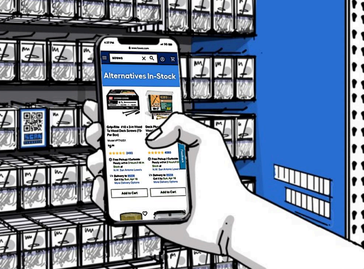
QR Codes for Out-of-Stock Products
When a customer can't find what they came for, the experience doesn't have to end there. Research showed that 18% of Pros specifically wanted a QR code near out-of-stock products linking to similar available items. We recommended placing contextual QR codes directly on product cards, giving customers a self-serve path to alternatives and keeping them in the purchase funnel without requiring associate intervention.
Surfacing In-Store Mode via Push Notification
None of our 12 moderated session participants intuitively discovered In-Store Mode on their own. Many mistook the entry point for an advertisement. We recommended triggering a push notification when a customer enters a store, surfacing In-Store Mode at the moment it's most relevant. Meeting customers with the right tool at the right moment removes the discovery burden and makes the feature's value immediately apparent.
QR Codes Linking to the Paint Visualizer
Customers were enthusiastic about the paint visualizer once they encountered it, but few knew it existed. We recommended placing QR codes directly in the paint aisle, linking to the visualizer at the point where customers are actively making color decisions. This addressed both the discoverability gap and the context problem, putting the tool in front of customers when their intent was highest.
Outcomes
The engagement produced QR code placement guidelines adopted by the team and informed a subsequent revamp of the paint visualizer experience, implemented in alignment with our recommendations. While this was a strategy and discovery engagement rather than a shipped product, the work created direct downstream impact on two live customer-facing experiences.
Reflection
Discovery work without a clear downstream owner is a common organizational risk. On this project, the strength of the recommendations was only as durable as leadership's appetite to act on them. That shaped how I think about framing research now — not just as insights, but as decision-forcing documents that make the cost of inaction visible.